InfoSparks Manual and FAQs

Modified on Fri, 17 Oct at 5:21 PM

Real Estate Stats for Your Market, Your Way

InfoSparks is a housing market research tool designed specifically for ease of use, fast analysis and simple sharing. All real estate is local. Let's explore your housing market together.

Highlights of what you can do with InfoSparks:

  • compare up to four geographies at a time
  • filter search results by countless housing variable combinations
  • examine housing market metrics as counts, medians and averages
  • customize price and square footage ranges
  • use it on your mobile device
  • share search results online, in print, via email and even with live data widgets!

Now let's jump right in and get the most out of this amazing tool! If you're more about videos, then WATCH THIS TUTORIAL (best viewed in full-screen 1080p HD; give it a moment to reset).

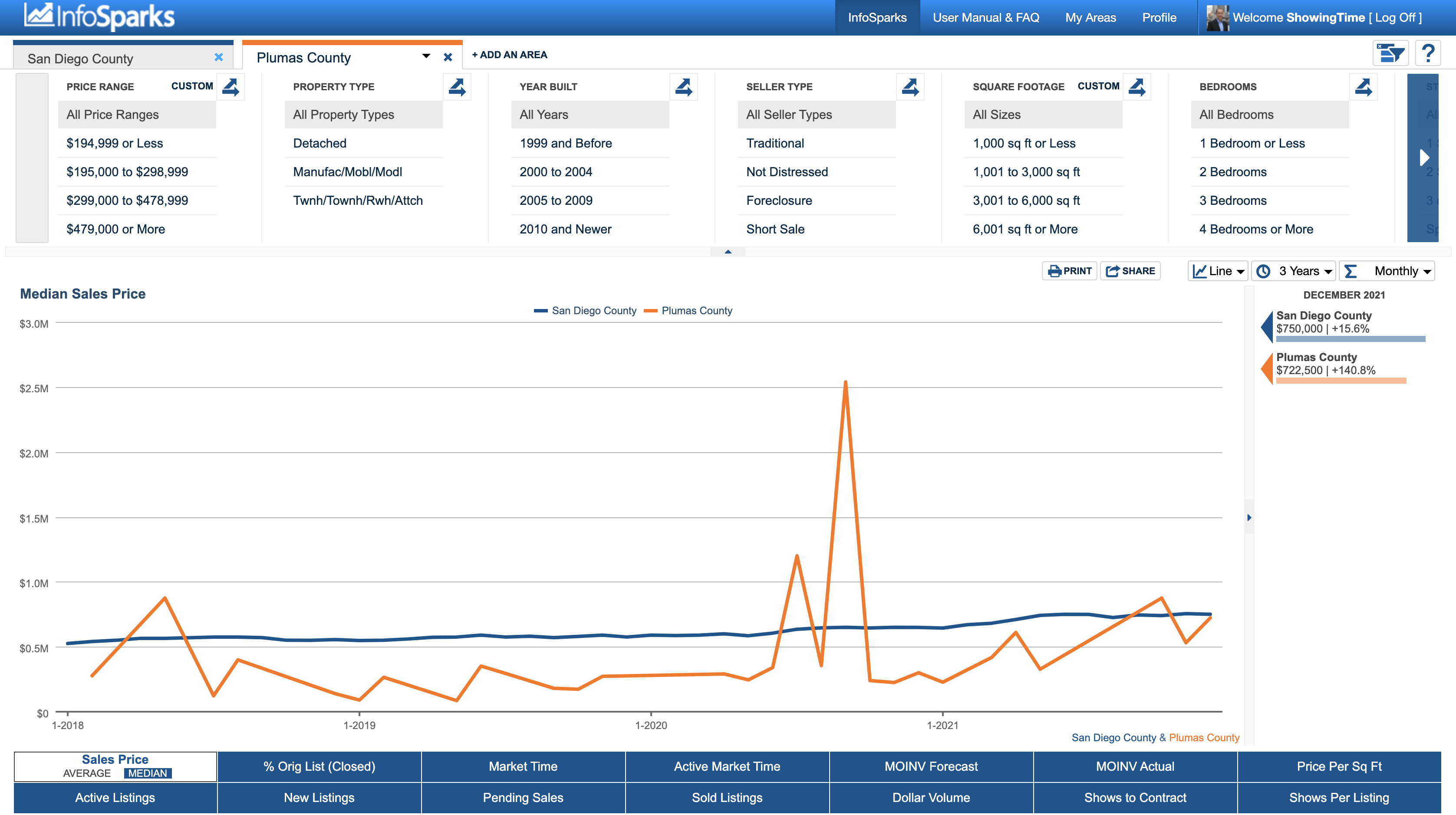
Let's start with a screenshot. Or an even LARGER screenshot.


Top Bar

The tool logo is on the left side. Tool options and profile information are on the right side. Easy enough. Moving on.

My Areas

Stored items from the mapping utility are located here.

Profile

Saved search parameters can be found here. Your profile is tied to your login credentials.

Select the question mark icon for basic tips on each section of the tool.


Tabs

Selection
Enter your inputs here. A drop-down list displays an alphabetical list of available searchable items or you can just start typing. You may add up to four tabs for comparison. The default is the San Diego County.
Single-Tab Filters
Below the searchable list of items associated with your community are a set of filter options, including Counties, Market Areas, Communities and ZIP codes.
Multi-Tab Filtering
When a second item is added, that item becomes the default filtering agent for direct comparison to other items. Whatever variables you choose here will be applied to all tabs. Similarly, you can choose a different tab and give it different variables. While any item is selected during multi-tab filtering, that item will be the hub of all selected variables. Filtering can be toggled on and off so you can also compare disparate variables to one another.

My Areas

Your local housing market defined by you!


The "My Areas" option brings you to a mapping interface where you can draw your own areas for customized statistics.

Pick a predefined area on the left or type a location (address, city, landmark, ZIP code, etc.).


Use the polygon or circle tools to draw custom shapes on the map. Connect first and last points to finish a shape. Restart, save and trash areas with ease.

To delete shapes you are working on and start over, select the crossed-out circle to receive a Delete Shapes message box.

If you are happy with the shape(s) you have created, select the green Save button. You'll get a message that asks you to choose to create a new area or replace an existing area.


Once you have saved your shape, a green box will tell you the amount of square miles and the amount of listings that the area contains. You can choose to See Stats or go Back to the Map.


Area shapes are accessible on the drop-down list at the top-right of the map toolbar. Shapes not visited for an extended period will still exist on the list but will go from Active Areas to Archived Areas.

Delete saved shapes by clicking the red trash can.

After shapes are made and saved, a blue Stats button will exist in place of the green Save button. This will bring you to the stats in the main viewing area of InfoSparks. A My Areas filter will now appear alongside other Area filters.

Inactive/Archived Items in My Areas

A custom-designed area is listed under Archived Areas if it is not accessed for 60 days. To reactivate an area, select it from beneath the Archived Areas within the drop-down list. With the area selected, simply choose Save to reactivate it.


Variables

Within each vertical variable category, a selected option will be plotted into one item on a chart unless the double-arrowed splitter "Breakout" icon is selected. Breakouts can only be performed on one vertical variable category at a time.

Breakouts
Select a double-arrowed splitter icon to look at each item in that vertical variable category as a stand-alone value.
Price Ranges

Ranges adjust for each area based on its sales history. Sold home prices are used when filtering by price for metrics with calculations based on sold data, and original list prices are used when filtering by price for non-closed metrics. Price ranges are customizable.

You may notice that Price Range historical line charts go flat when you mix it with Sales Price in a 12-month view. That's because these combinations create medians/averages for defined price ranges which will remain relatively static.

Property Type
Separates activity by Detached, Manufactured/Mobile/Modular and Twinhouse/Townhouse/Rowhouse/Attached.
Year Built
Separates activity by 1999 and Before, 2000 to 2004, 2005 to 2009, and 2010 and Newer.
Seller Type
Separates activity by sales that are Traditional, Not Distressed, Foreclosure and Short Sale.
Square Footage
Ranges are established through discussions with your local MLS, and they are customizable.
Bedrooms
Separates activity by properties with 1 Bedroom or Less, 2 Bedrooms, 3 Bedrooms, and 4 Bedrooms or More.
Stories
Separates properties by 1, 2, 3 or 4 Stories and Split Level.
Acreage
Separates activity by Less than 1 AC, 1 Up to 4 AC, 4 Up to 10 AC, and 10 AC or More.
Age Restrictions
Separates activity by None, 55+ and 62+.
Pool Type
Separates activity by No Pool, Pool, Community and Private.
When areas are in Filter mode, there are some limits to breakouts depending on the number of areas in play. This is because the number of charted elements can become overwhelming and difficult to understand. Here are the limitations:
1 Area
No breakout limits! (five data elements)
2 Areas
Limited to three breakout items (six data elements)
3 Areas
Limited to two breakout items (six data elements)
4 Areas
No breakouts allowed (four data elements)

If users try to select more than the maximum allowed options, the option selected earliest will automatically deselect.

When not in Filter mode, users have the ability to change variables on a per-area basis. Breakouts are not available when out of Filter mode. This is important, so it bears repeating: Users may select only one variable.


Custom Ranges

Most values are predefined, but you can customize your own values for some variables. Next to customizable variables, select "Custom" to access the menu options.

In the first drop-down, you can select which area's ranges you would like to edit and customize. With an area selected, the existing prices will be in the editable text boxes. Simply type in your own values where you see fit.

Select "Custom Range" from the drop-down to start with a clean slate. Once all of the numbers are filled in and you would like to start over, select the "Clear" button found below the ranges to yet again have a clean slate.

If nothing is selected in the first box of a paired range, the assumption will be "or Less." If nothing is selected in the second box, the assumption will be "or More." This allows for an infinite number of ranges to be charted.

Zero: 0 Sq Ft and $0 are not included in "or Less" ranges within any custom variables. These values skew the data and are considered invalid.


Time Calculations

The length of charted timelines may vary depending on MLS data availability; "1 Year" and "3 Years" are common timeline values and "Max" represents the end point for reliable history. Different metrics may have different Max values, depending on available data.


"12 Months" means Rolling 12 Months. Each data point is 12 months of activity. From any given month, go back 12 months and total it up. In this view, the historical line graph will generally appear smoothed out because there is more sample data for each point on the line. Other options include Monthly, which shows only a month of activity for each data point, and Year to Date, which shows activity from January to the current month for the years shown. Year to Date is only available in bar chart format.

As with Rolling 12 Months, Rolling 6 Months and Rolling 3 Months represent rolling 6-month and 3-month segments of activity, respectively.


Charting

You can choose to display either a line or a bar chart.

The charted area shows the combination of geographic areas with variables and metrics up to the most complete month of data. You can toggle charted items on and off in the legend. You can select anywhere on a line or bar to see individual values, and you can see the variable elements for each chart just below the x axis.

Line charts will not show values on the line until selected, whereas bar charts will always show values. When selected, whether a line or bar chart, the date, area and value will display. Data points are for one month of activity or for 12 months of activity as a single point, depending on whether Monthly or 12 Months is the chosen time calculation, the latter of which is better for trend analysis and accounting for small sample sizes.

Bar charts will show percent changes for the years in which all data used to calculate the percent change is displayed in the chart. So, yes, that empty space is on purpose under the first year of any multiyear selection and for a time calculation set to 1 Year.

The chart's heading is the selected metric or metric + variable when in variable breakout mode. The legend shows areas or areas + variables in variable breakout mode. Below the chart are areas with variables or areas with nonbreakout variables in variable breakout mode. Metrics, areas and variables also transfer to Share options.

For all charts, the y-axis is based on the metric, the x-axis is time of year and there are never more than six variables on a single chart. For bar charts only, the maximum allowable number of years for historical comparison is three. Beyond that, you really should be using a line chart!

If a line or bar doesn't have any data, a "No Data" note will be added to the legend label. If there is no data for anything selected, a message will appear in the chart area that states, "There is no data available to display for the given criteria." Different verbiage may appear in no-data situations, but the message is generally the same: No dice; try again.


User-defined areas will have an asterisk (*) next to the name of the area in the descriptive text under charts. This is meant to help avoid confusion between same-named areas that are default to the system or added by you, the user.


Quick Facts

This is a quick display of the selected criteria with the value for the most current complete month of data with the % change vs. the same month last year.

Even though some charts with heavy calculations may load slowly, Quick Facts about the selected metric will always display immediately.

If there is no current data for a charted item, an N/A will appear here.


Metrics

Metrics represent the residential real estate topics that areas and variables pop against. Some are counts, some are calculations. Some calculations are median, some are just average. In combination, they are the primary descriptors for what makes a market tick. Only one metric can be selected at any time.

Sales Price
Calculations are based on sold data. Prices do not account for seller concessions. Median represents the point at which half of the homes that sold in a given month were priced higher and half were priced lower. Average is the mean sales price for all closed sales in a given month.*
Percent of
Original Price (Closed)
Percentage found when dividing a listing's sales price by its original list price, then taking the average or median for all sold listings in a given month, not accounting for seller concessions. Calculations are based on sold data. Example:
A property is listed at $200,000, reduced to $190,000 and taken off the market. Then the same property is listed again at $180,000 a few months later and is further reduced to $175,000. It closes for $160,000. We take the ratio of $160,000:$180,000 or 88.9% instead of $160,000:$200,000 because a new listing ID was issued.
Market Time
Median or average number of days between when a property is listed and when a property is closed in a given month.*
Active Market Time
Median or average number of days between when a property is listed and when an offer is accepted in a given month.*
MOINV Forecast
Months Supply of
Inventory Forecast
Active Listings at the end of a given month, divided by the average monthly Pending Sales for the last 12 months. Also known as absorption rate.

MOINV Actual
Months Supply of
Inventory Actual
Active Listings at the end of a given month, divided by the average monthly Closed Sales for the last 12 months. Also known as absorption rate.

Price Per Square Foot
Calculated by taking an average or a median of closed sales price divided by square footage for each individual listing in the current period. Calculations are based on sold data. Prices do not account for seller concessions.*
Active Listings
The number of properties available for sale in active status at the end of a given month. Also known as inventory. For this metric, the "12/6/3 months" calculation is the average of the most recent 12/6/3 months of data.
New Listings
A count of the properties that have been newly listed on the market in a given month.
Pending Sales
A count of the properties on which contracts have been accepted in a given month.
Sold Listings
A count of the actual sales that have sold in a given month. Calculations are based on sold data.
Dollar Volume
The total dollar amount of all sales for the selected criteria.
Shows to Pending
The number of showings scheduled per listing that went into pending status during the selected reporting period.
Shows Per Listing
The average number of showings scheduled on active listings per month. Data begins in January 2012.
Example: There are 100 active listings during a given month for a given geography. Between those 100 active listings, there were 1,000 active days. Divide 1,000 by 30 days (for 1 month) to get 33.3. There are 500 showings during the month, so 500 divided by 33.3 equals 15.0 Shows Per Listing for the month.


Share

All print/export/email options are here, including live, static and embeddable charts and images, as well as raw data tables.

Shared items will include your contact information, which is automatically generated from the information stored in your Profile in the upper right hand corner of the tool.

Share Options

Step 1 involves choosing whether you would like to share live or static data.

Step 2 involves the way you would like to share it. This could be as a printable PDF, a dedicated link for social media and email purposes, an embeddable widget for your blog or website, or raw data in comma-separated value (.csv) format that can be designed to your specifications within a spreadsheet program.

After choosing, you will be given a URL to share, open in a new window or download to your computer. If you decide you don't like the parameters you've chosen, you simply need to select "Start Over."

Shared Chart Expiration
Upon initial creation, shared charts are automatically active for 6 months. Charts will be extended by an additional 2 months if the chart's creator is an active MLS subscriber and the chart has been visited in the past 90 days and is within 60 days of its expiration date. Users can also renew charts by logging into InfoSparks and visiting the chart within 30 days of expiration.

CSV Sharing
Shared chart expiration rules do not apply to CSV sharing. CSV files can be extended by visiting live CSV links within 30 days of logging into the tool.

Inactive MLS Subscribers
For users who become inactive MLS subscribers, all of their chart expiration dates will automatically be moved to 30 days from the time we detect inactivity (per MLS). This applies to both created charts and CSV files. If a user becomes active again within those 30 days, that person's charts will be extended by the usual expiration parameters.


FAQ

Why can't I get the tool's numbers to match my own personal MLS search?
If you do your own data pulls from your MLS system, you may see differences. These differences can often be attributed to variations in search criteria, our data-scrubbing methods, or different data pull dates or times.

How do you account for potential data errors?
We utilize a special data-scrubbing elimination algorithm to "purify" data. For example, if an agent accidentally entered a sales price of $77,777,777, we assume that the agent had a busy day with lots of showings and fell asleep on the keyboard. Similarly, an entry of 1,800,000 total finished square feet seems a little high, so it gets scrubbed out.

How often is your data updated?
Data for a new month is released on the first of every month at 2:00 am Pacific Time. Updates to all (including historical) data are performed each night to reflect any changes made to the underlying MLS data.

If I embed a chart on my website or blog, how long will that remain active?
Charts are active for specified number of days based on MLS subscription status and chart visitorship. For information on timeframes for embedded charts, see the Share section of this User Manual.

How can I share the actual numbers along with the charts?
There are multiple ways to share the numbers. Sharing any type of live data will display the numbers on line charts with mouseover or touch selection. If you share a bar chart, the numbers are right there on the screen, so that's a good thing. Sharing the CSV option will give you a rudimentary set of numbers in table format based on the geographic, housing variable and time parameters you have set. You'll need to add formatting such as dollar signs and commas to CSV output, but CSV is a great option to see numbers if you have even basic ability with spreadsheet software. Some users have asked why they can't print the Quick Facts to the right of the chart area. It's a separate element from the Share function, so if you want to turn the visible Quick Facts into a shareable image, screen capture is your best option.

What is live data vs. frozen data?
You may notice that numbers seem to shift from month to month. For example, something that said 1,000 sales for a January report might say 1,023 sales for January in a February update. This is because InfoSparks is constantly "updating history." Instead of freezing the data and reporting only that number at a single given point in time, it is refreshed on a regular basis, reporting the most current numbers available in the MLS. This accounts for the reality of an ever-changing market and catches important edits to previously accounted for data. (For example, a sale will be removed if the deal collapses.)

Are there any common browser or operating system issues?
The tool will work on Chrome, Firefox, Safari and Internet Explorer (version 7 or higher). Avoid using your browser's "Back" button or arrow. It will take you out of the tool. If you want to go back to the first "page" of the tool, delete all areas.

How many data combinations can this tool create?
The number of possible graphs is about 4 * 10^19 per metric per location or 40,000,000,000,000,000,000 (40 quintillion!) per location per metric.


Need Local Assistance

If you have any problems or questions please call SDMLS Support Service (858) 373-4010

or send an email to - Support@sdmls.com


Was this article helpful?

That’s Great!

Thank you for your feedback

Sorry! We couldn't be helpful

Thank you for your feedback

Let us know how can we improve this article!

Select at least one of the reasons
CAPTCHA verification is required.

Feedback sent

We appreciate your effort and will try to fix the article